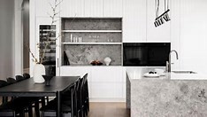
The simple pairing of black and white has timeless appeal and, when done right, can be a stroke of design mastery, as this Malvern home proves.
Monochrome is a scheme that's always in style, especially when it comes to the kitchen. Employing the use of such contrasting shades has a striking effect, while premium materials and attention to detail earns a kitchen the title of 'luxury'. To hold ground in a deluxe space, your appliances need to reflect a superior level of detail, performance, and finish — whether they're the heroes of the room or blend in to accentuate the kitchen design.
As such, choosing the right appliances is not only about practicality but one of design, as they're used to give authority as to how the space is used; from seasoned chef to avid entertainer, or family-friendly hub. This is even more important nowadays with the enduring love of open-plan living which sees the kitchen, dining and lounge rooms meld into one.
In the past, appliances were often an afterthought when it came to kitchen design, but those days are long gone. Now, there's not only an extensive range of options in varying sizes, colours and technology offerings, there's also more types, such as dedicated wine fridges, which are made for modern living.
CONSIDERED AESTHETICS
When choosing appliances, look for those from the same collection. This selection of Fisher & Paykel appliances are from the Series 9 Minimal product family so designed to feature together.
CONSIDERED FUNCTIONALITY
For the owners of Nicholls Street, the brief for their kitchen was much like any other: a functional and stylish space for entertaining fitted with appliances that cool, cook and clean. However, turning this into an entertainer's delight is the integrated, which is designed to fit flush, with no visible hinges or grilles. It's makes for a striking showpiece while still allowing the white V-groove joinery to be the hero.
CONSIDERED LAYOUT
Where you place your appliances is just as important as the style you choose. The working triangle is a design rule you may be familiar with, where the fridge, cooktop and sink are placed at the three points of the triangle for maximum functionality. However, there's more to consider when you have additional appliances. In this space, the wine fridge was purposely situated near the dining area, away from the cooking zone, to ensure guests are able to be served drinks easily, and the combination microwave and oven positioned to the side so they don't interfere with the food preparation area.
So, is black back when it comes to appliances? Black never left. And, as this kitchen proves, when used right this dark, moody hue demands attention where it's needed and recedes as required.
Source:Homestolove
